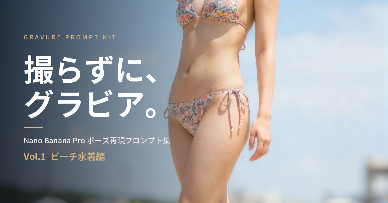
「色っぽく」「グラビアっぽく」。
画像生成AIに水着の1枚を頼むとき、だいたいこう書く。
すると、露出度高めの女性が、なんとなく立っているだけの絵が返ってくる。
私も最初はそうだった。Nano Banana Pro(Gemini 3 Pro Image)は賢いと聞いて、雰囲気で投げた。出てこない。何度投げても、私の琴線にグッとくるような絵は出ない。
理由はひとつでした。
このAIは「色っぽく」が読めない。「腰を35度ひねる」なら読める。
雰囲気の言葉にとても弱くて、数値にとても強い。だからプロ級の1枚は、指示の精度で決まります。腰の角度。視線の落とし方。レンズの絞り。光の回し方。そこを数字と位置で渡すと、別物のように決まる。
そんな、グッとくるグラビア写真を出すためのプロンプトをまとめました。
ここでは、サンプルのプロンプトを1本、詳しい解説とともに全文公開しています。
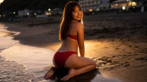
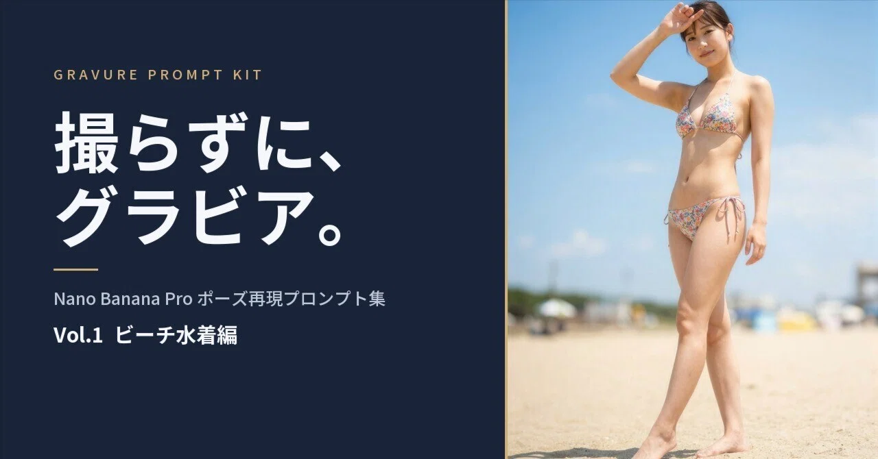
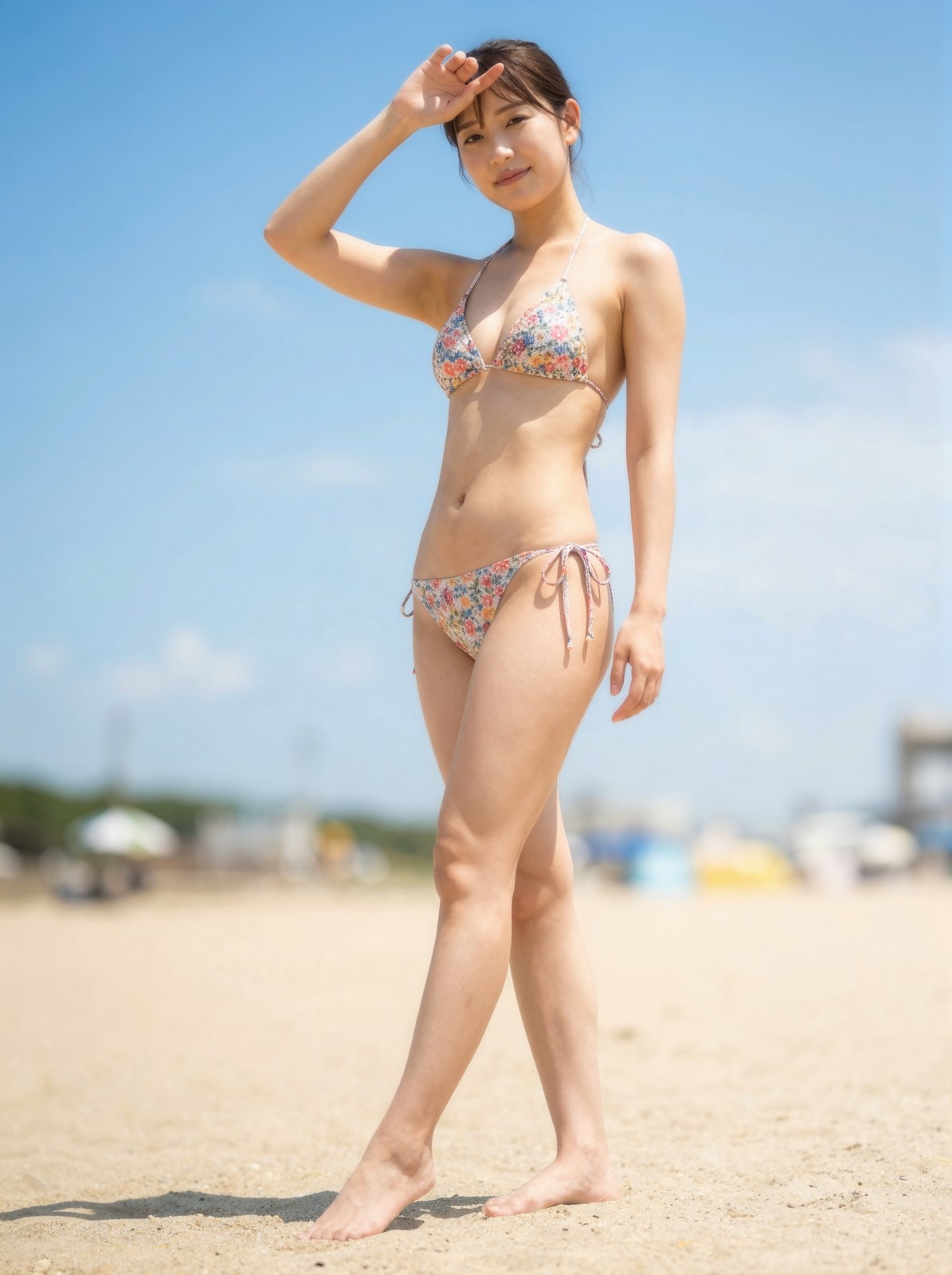
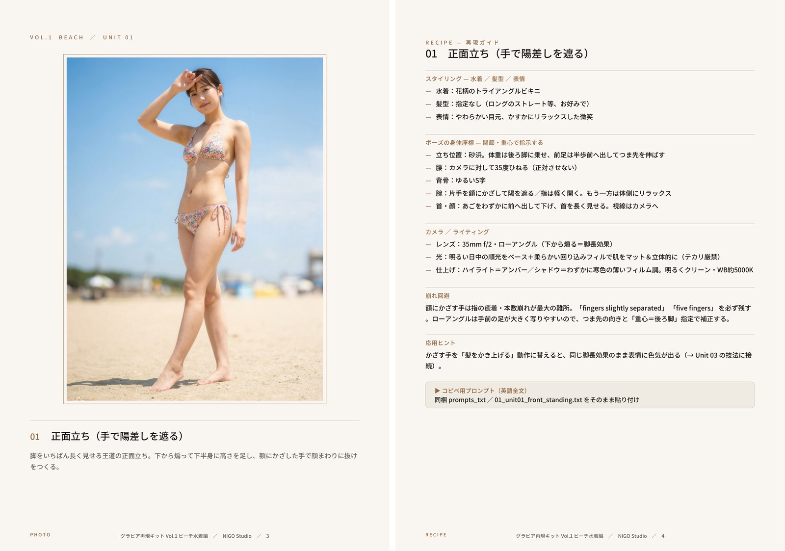
正面立ちの作例と、その全文プロンプト
下の作例は、収録プロンプトの1本「正面立ち」を、そのまま貼って出した1枚です。盛っていない。下のプロンプトをコピペして、あなたのNano Banana Proにそのまま渡してみてください。
{
  "subject": "professional swimwear model, Japanese woman in her early 20s, natural healthy body, on a beachwear magazine gravure shoot",
  "camera": "full-body shot, low angle from below, 35mm f/2",
  "pose": {
    "stance": "standing on the sand, weight shifted onto the back leg, front foot stepped slightly forward with toe pointed",
    "hips": "hips tilted and angled 35 degrees to camera",
    "spine": "gentle S-curve",
    "arms": "one hand raised to the brow shading the eyes from the sun, fingers slightly separated; other arm relaxed along the side",
    "head": "chin pushed slightly forward and down, neck elongated, looking toward camera"
  },
  "expression": "soft eyes, faint relaxed smile",
  "outfit": { "swimwear": "floral triangle bikini" },
  "scene": "sandy beach, blue sky background",
  "lighting": "bright midday natural sunlight",
  "action": "professional model demonstrating a confident standing pose during a beachwear magazine photoshoot",
  "optics": "prime lens, shallow depth of field, creamy out-of-focus background bokeh (background melts, never pan-focus)",
  "lighting_base": "bright healthy daytime light as the base; soft bounced/diffused fill that wraps around the body to keep skin matte and dimensional — avoid hard specular shine on skin",
  "grade": "subtle film tone — warm amber highlights, faintly cool shadows, gentle tone curve for depth; clean and bright overall, NOT moody",
  "skin": "natural skin texture with fine pores, slightly lowered clarity so skin reads smooth-not-plastic, white balance ~5000K, healthy color, no AI sheen",
  "hands": "fingers relaxed and visible, natural hands with five fingers",
  "format": "vertical 3:4 portrait orientation",
  "quality": "photorealistic editorial gravure photograph, magazine print quality"
}

Render as a single photorealistic vertical editorial gravure photograph with the body coordinates above. Shallow depth of field, creamy background bokeh, bright healthy light with soft wrapped fill (matte non-shiny skin), subtle film grade. Natural anatomy, five fingers per hand, no extra limbs.
どこを見ればいいか
プロンプトは体の置き方に翻訳してあるのが分かると思います。
体重は後ろ脚。前足は半歩前でつま先を伸ばす。これで脚がいちばん長く見える。腰はカメラに対して35度。正面を向かせない。low angle from below でAIに下から煽らせて、下半身に高さを足す。
雰囲気語はひとつも要りません。要るのは数値だけ。出ない人は、たいてい数値を書いていないだけです。
中身を1ページ、お見せします
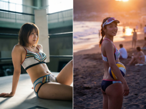
下は、収録している誌面の見本です。左が作例、右がその1枚を出すためのレシピ(身体座標・カメラ・崩れ回避)。これが17ユニットぶん入っています。
盛っていません。右のレシピをそのまま貼ると、左の作例が出ます。
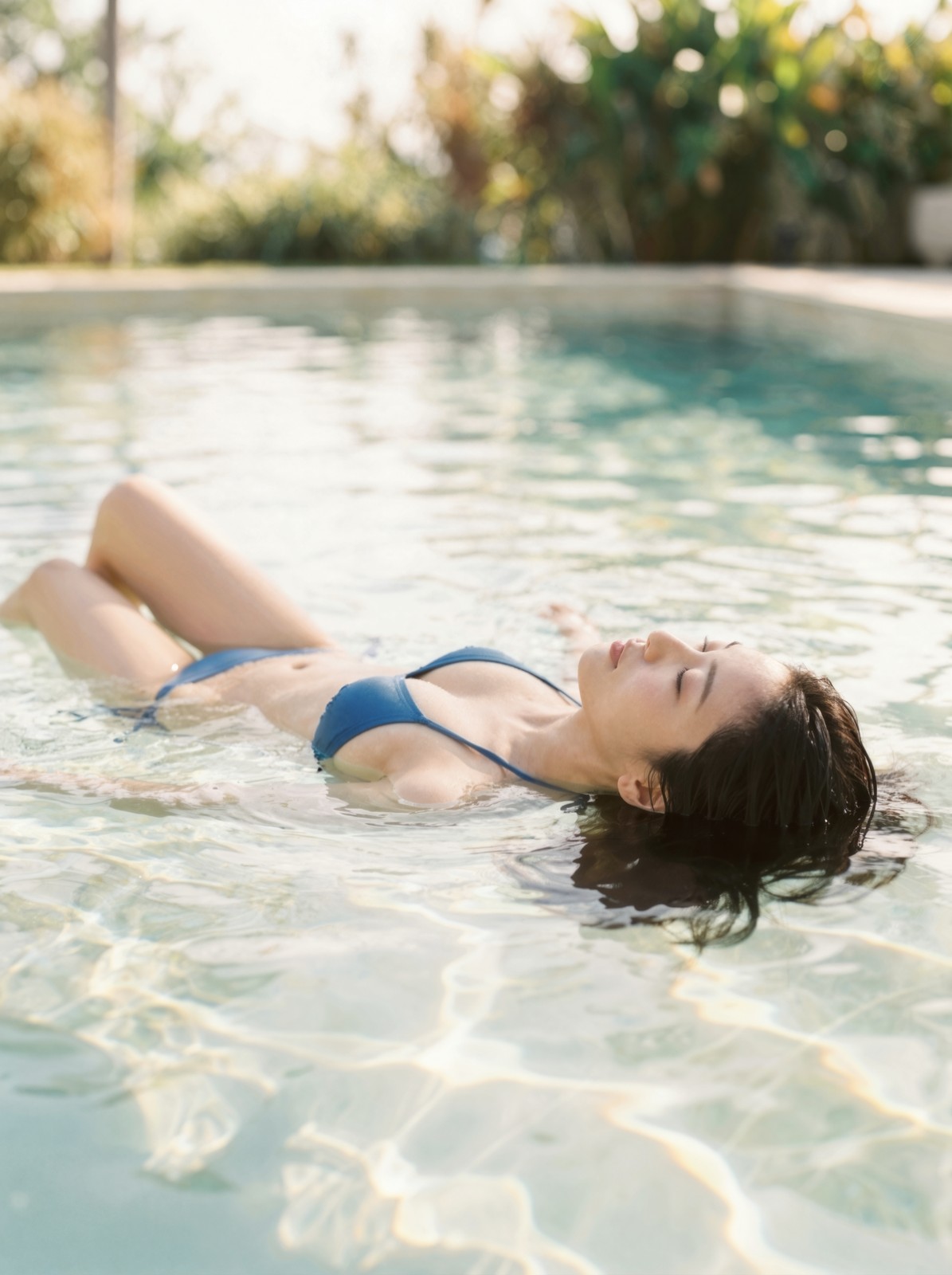
収録(全17ユニット)
本編14ポーズ
正面立ち/肩越し振り向き/プール濡れ髪/砂浜横座り/うつ伏せ/プール浮遊/しゃがみ/後ろ姿振り返り/膝立ち/見下ろし/真横くびれ/逆光ボディコンター/横向き寝そべり ほか。
ボーナス3本
ライティング差し替え/背景差し替え/アングル差し替えの「応用技」。
ひとつのユニットに入っているのは、完成作例(実際にそのプロンプトで出た1枚)、コピペ用プロンプト本体(JSON全文)、身体座標の日本語解説、カメラ/レンズ/ライティングの指定、崩れ回避のコツ、水着・髪型・表情のスタイリング欄。試食で渡した1本と同じ密度のものが、17本ぶんあります。
なぜ「数値」と「JSON」で書くのか
雰囲気語(色っぽく・グラビアっぽく)は、AIには曖昧すぎて伝わりません。代わりに、関節・視線・絞りを数値と位置でJSONに落とす。すると別物のように決まります。
際どい言葉で弾かれる問題も、身体の構造を淡々と数値で記述することで、するりと抜けられる。そのコツを17本ぶん、再現できる形で作りました。
写真集は、買っても自分では1枚も出せない。レシピなら、何枚でも、誰でも出せます。
この画、自分で出せます。レシピあります。以下のnote記事をぜひご確認ください。